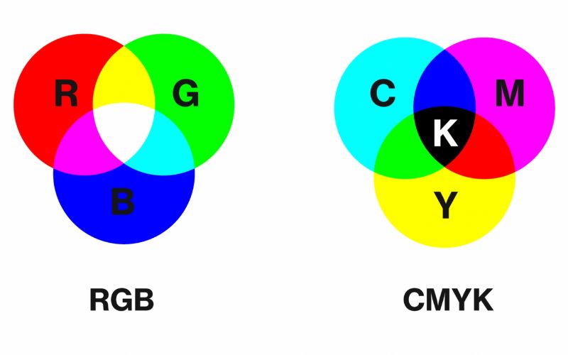
Colour plays a significant role in design, branding, and visual communication – it’s one of the most important elements when designing. When it comes to working with colours in digital and print media, understanding the differences between CMYK and RGB colour spaces is crucial. In this blog, I’ll help unravel CMYK and RGB colour spaces and explain best practices for you to use them effectively.
Understanding CMYK and RGB:
1. CMYK:
CMYK stands for Cyan, Magenta, Yellow, and Key (black). These colours are created by subtracting light from white paper. This four-colour process produces a wide range of colours by combining various percentages of these four ink colours. CMYK is used in printing to ensure accurate colour representation on physical materials like brochures, business cards, and signage. Click here to view some of the beautiful printed material designed by Somewhere Studio.
2. RGB:
RGB stands for Red, Green, and Blue. It is an additive colour model used in digital media such as screens, monitors, and electronic displays. RGB colours are created by adding varying intensities of these three primary colours of light. With RGB, the absence of light results in black, while the presence of all three colours in full intensity creates white. RGB is ideal for digital designs, websites, social media graphics, and any other visuals displayed on screens.

What are the best practices when using CMYK and RGB?
1. Know your medium and when to use the right colour space:
Understanding the medium where your design will be displayed or printed is crucial. If your design is intended for print, use CMYK colour mode to ensure accurate colour reproduction. If your design is for digital purposes, such as web or social media, use RGB colour mode to achieve vibrant and consistent colours on screens.
2. Don’t forget colour conversion:
When converting colours between CMYK and RGB, be aware that there may be slight variations in appearance due to differences in colour gamuts. Use reliable colour conversion tools or software to ensure accurate colour representation during the conversion process. Always check the colours after conversion to ensure they meet your expectations. I like to use the Pantone colour converter, which gives both RGB and CMYK breakdowns.
3. Pantone Matching System (PMS):
The Pantone Matching System is a standardised colour matching system used in the printing industry. It provides a vast range of pre-defined colours, making it easier to achieve consistent and accurate colour reproduction across different print materials. If colour accuracy is critical, consider using Pantone colours alongside CMYK to ensure precise colour matching.
4. Proofing your work and using test prints:
Before finalising your design for print, it’s essential to review a proof or print a test copy. This step helps you identify any potential colour shifts or issues that may occur during the printing process. Adjustments can be made if necessary to achieve the desired colour output.
5. File formats are crucial:
When saving your design files, consider using file formats that support both CMYK and RGB colour spaces, such as TIFF or PSD. This allows flexibility for future use, whether for print or digital purposes.
In conclusion, understanding the distinctions between CMYK and RGB colour spaces is vital for achieving accurate and consistent colours in your designs. By using CMYK for print media and RGB for digital displays, and following best practices such as colour conversion, utilising Pantone colours, and proofing, you can ensure that your designs look their best in any medium. Remember, colour accuracy enhances the visual impact and effectiveness of your creations, making it an essential aspect of design excellence.


